SkiffleBox
A surf clothing brand I designed end to end, from the brand strategy through to a working online store.
Context
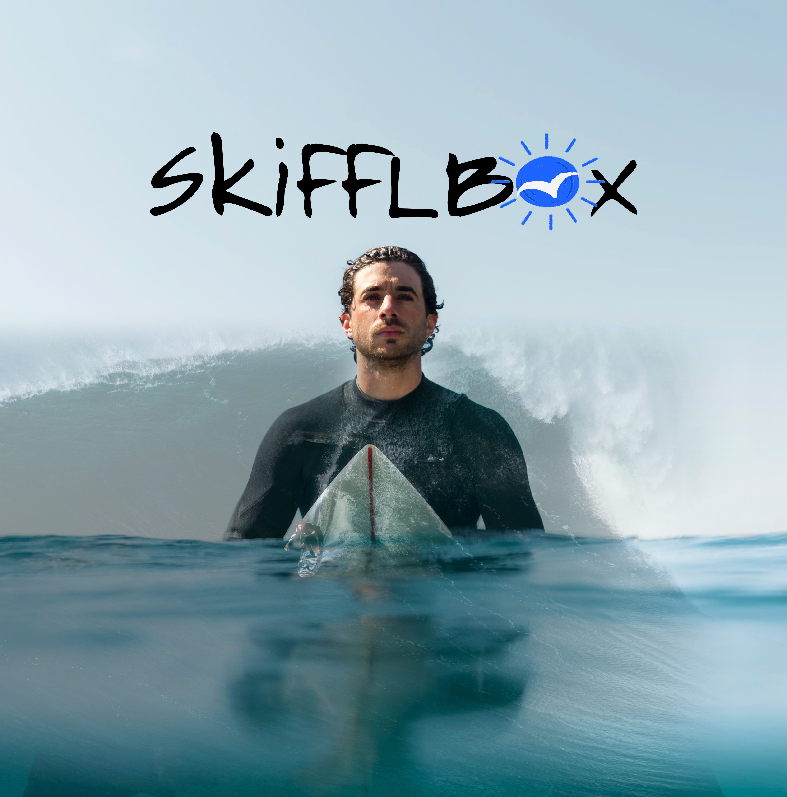
Most surfwear I looked at fell into one of two ruts. The heritage labels lean so hard on nostalgia they end up looking dated. The newer ones are clean but a little lifeless. I wanted to find the middle: something that feels genuinely vintage and genuinely modern at once.
That was the whole starting point for SkiffleBox. The clothes borrow the warm, saturated look of 50s and 60s surf culture and clean it up for someone shopping now. Sustainability is part of the promise rather than a badge added later.
My role
I handled all of it: brand strategy, the visual identity, the design-system documentation, and the full store experience.
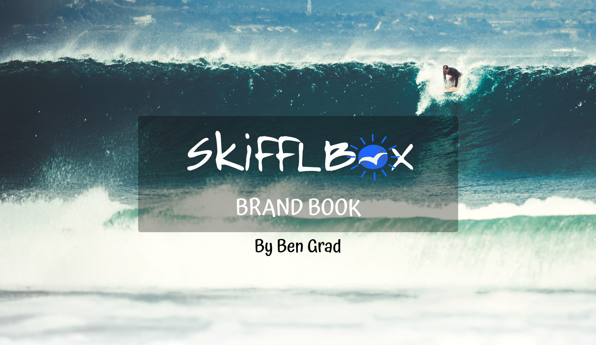
I started with the brand before any screens existed. I wrote the vision and values first, then turned them into a 33-page brand book, and only then designed the store on top of it.
The brand book
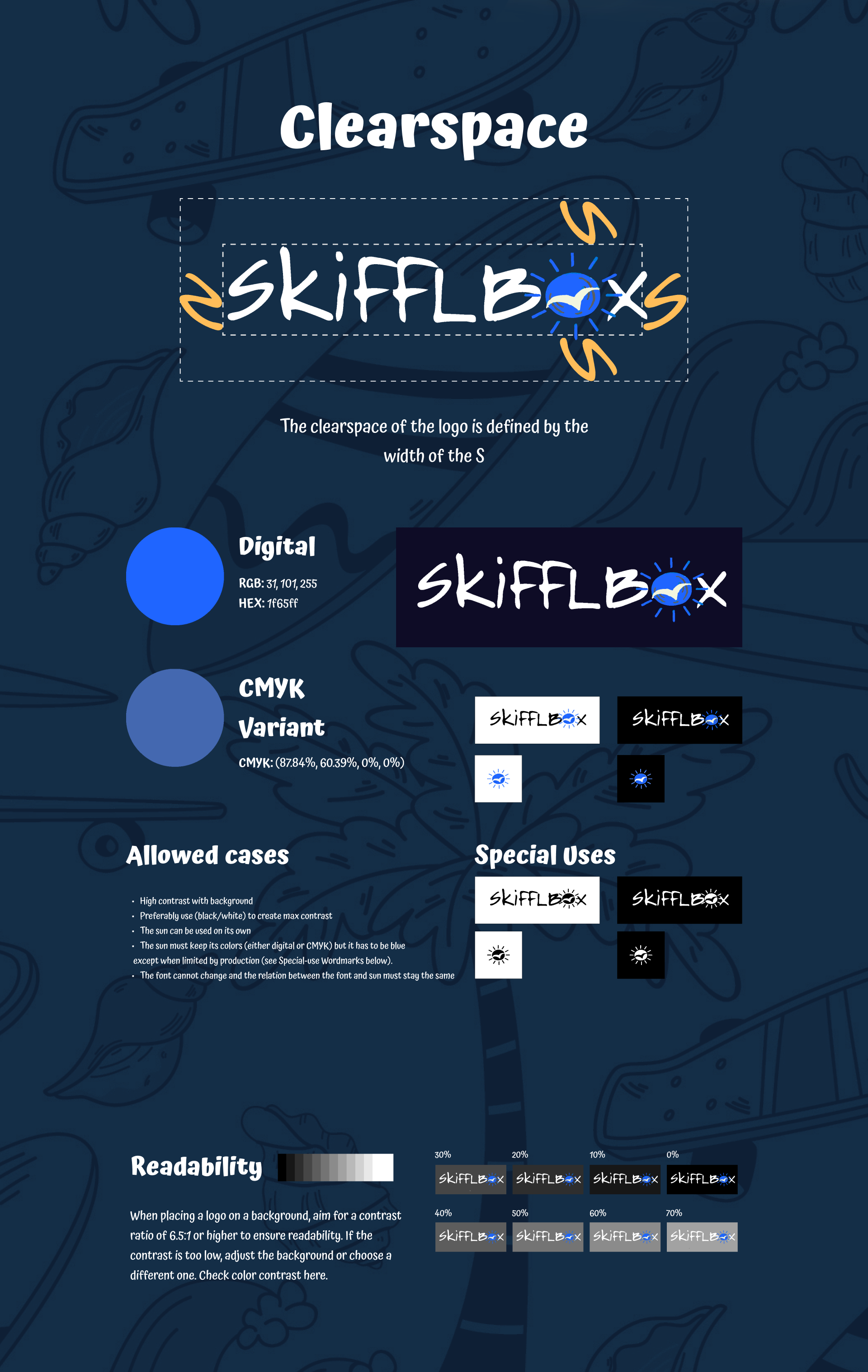
The 33-page brand book is where most of the thinking lives. It covers how the logo is built from the sun mark and wordmark, sets clearspace by the width of the “S”, defines the color system around a digital blue (#1F65FF, with a CMYK version for print), picks the type (Atma for display, Long Cang for accents), and holds contrast to at least 6.5:1 so nothing becomes hard to read.

The book doesn't stop at a logo sheet. It puts the mark on the actual product, then sets the rules for everywhere else: allowed and special uses, a readability rule for low-contrast backgrounds, and a full page of what to avoid next to the proper examples to copy instead. The point was a system someone could pick up later without breaking it.
That same system runs the campaigns. Every post keeps the sun mark, the ocean palette, and one line, “dress as you surf,” so an ad reads as SkiffleBox before you get to the words.
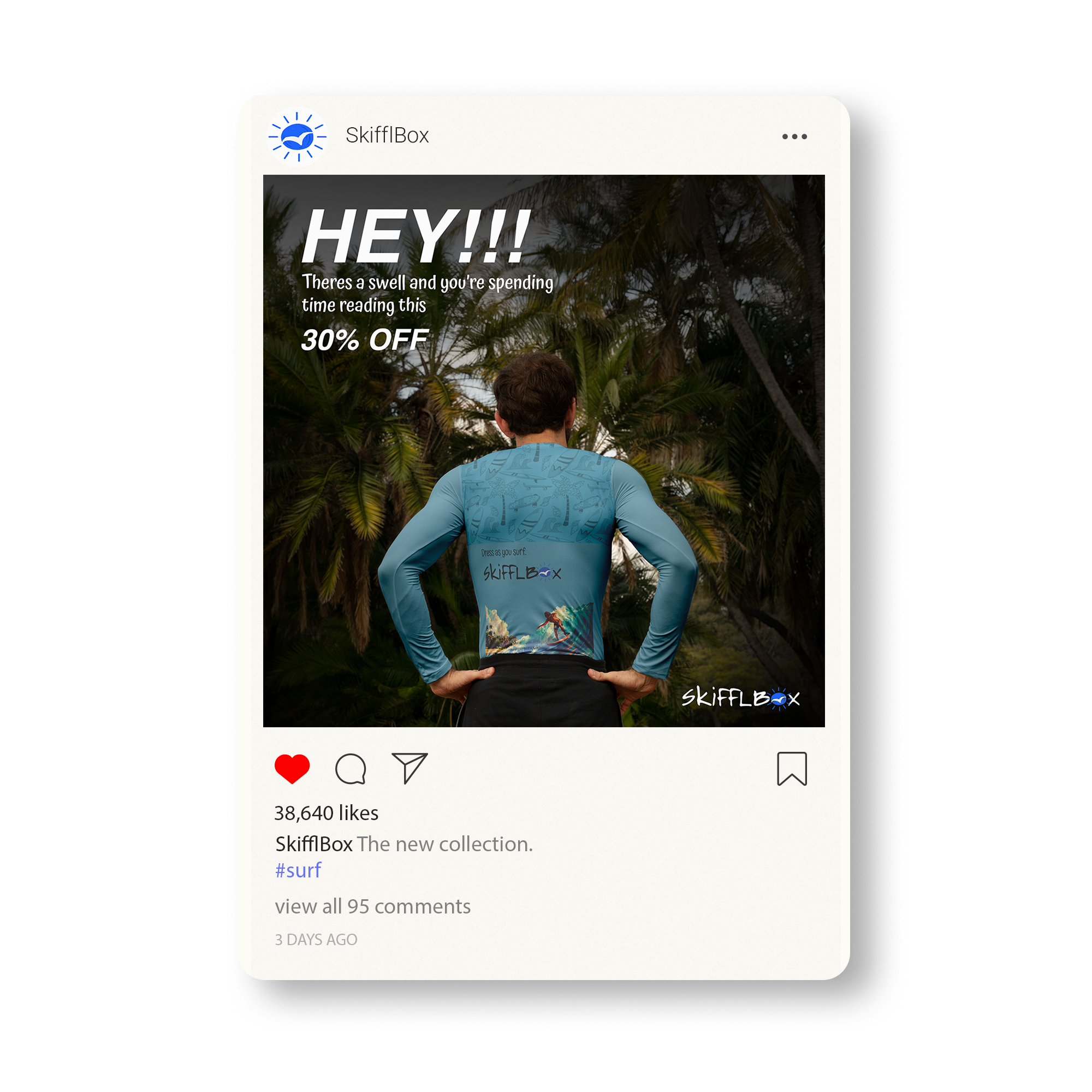
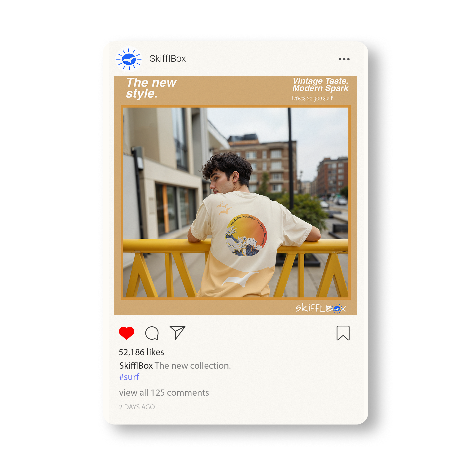
Work to surf and surf to live.The line the whole brand hangs on
The store
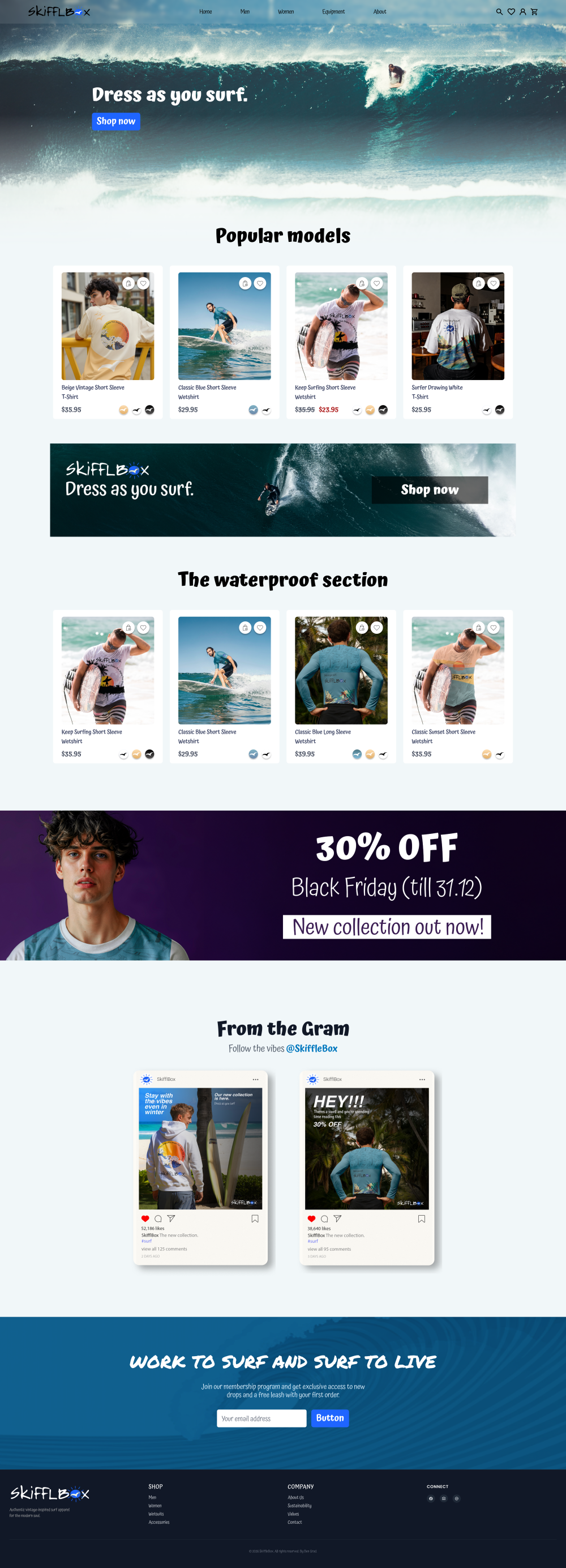
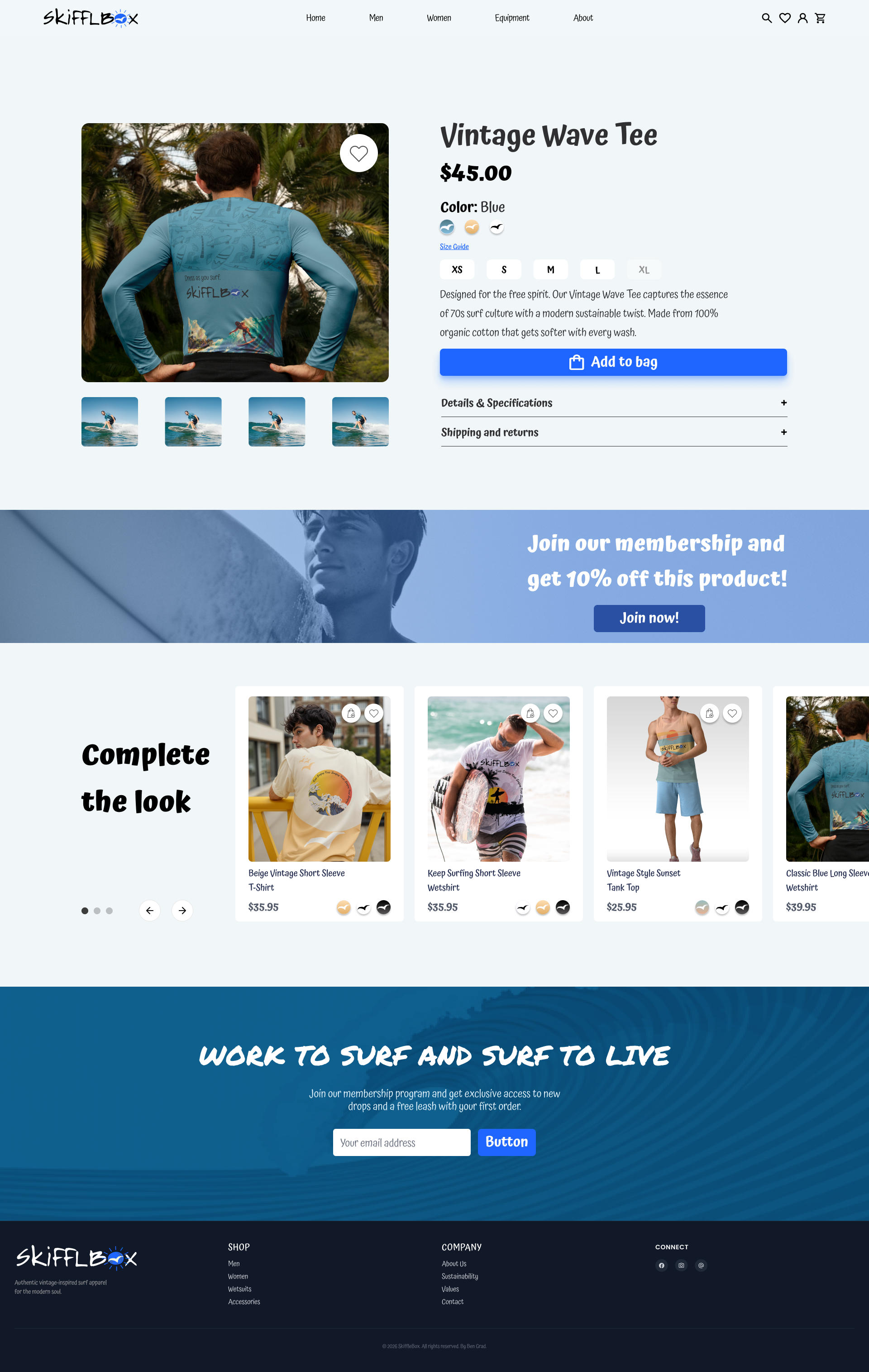
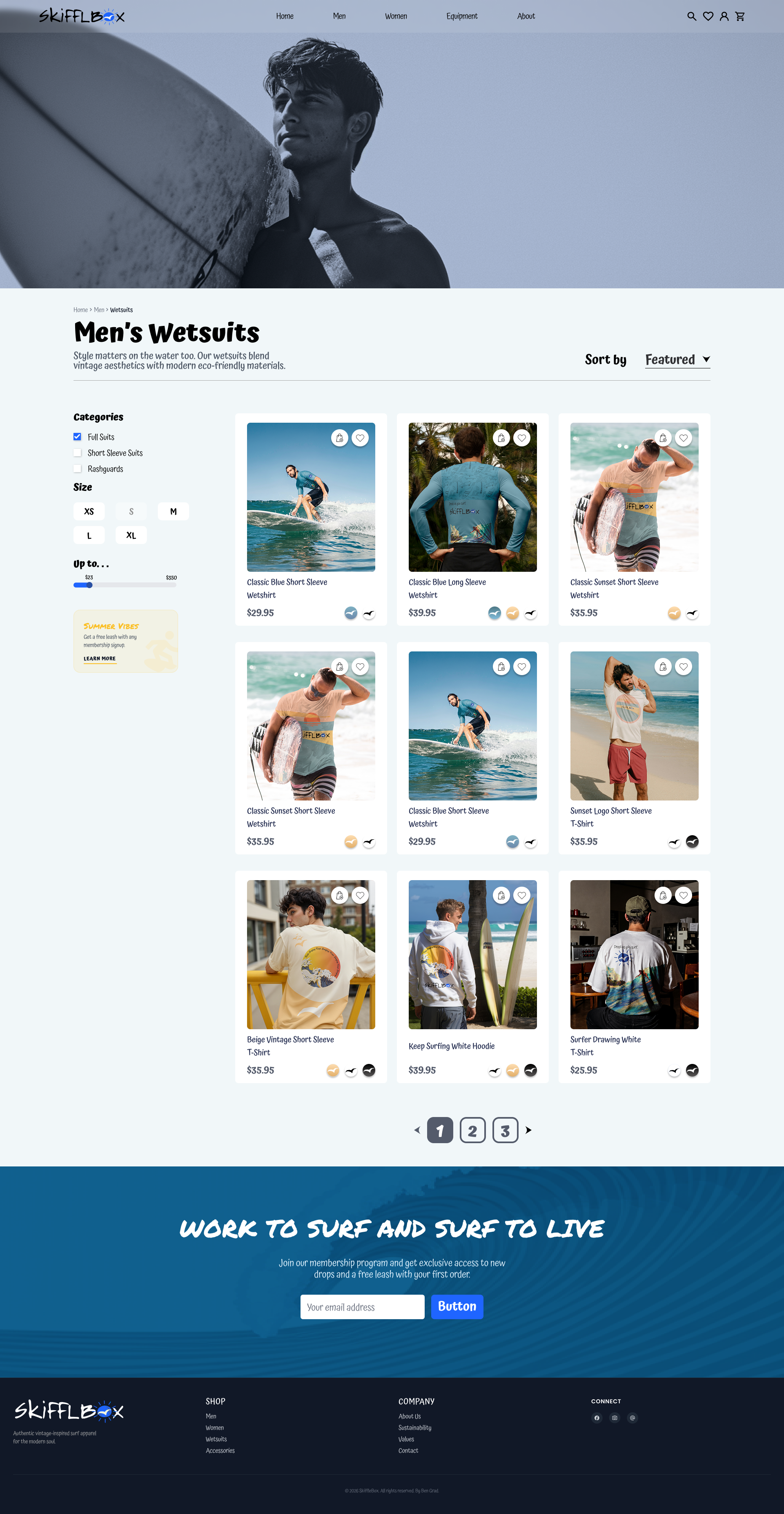
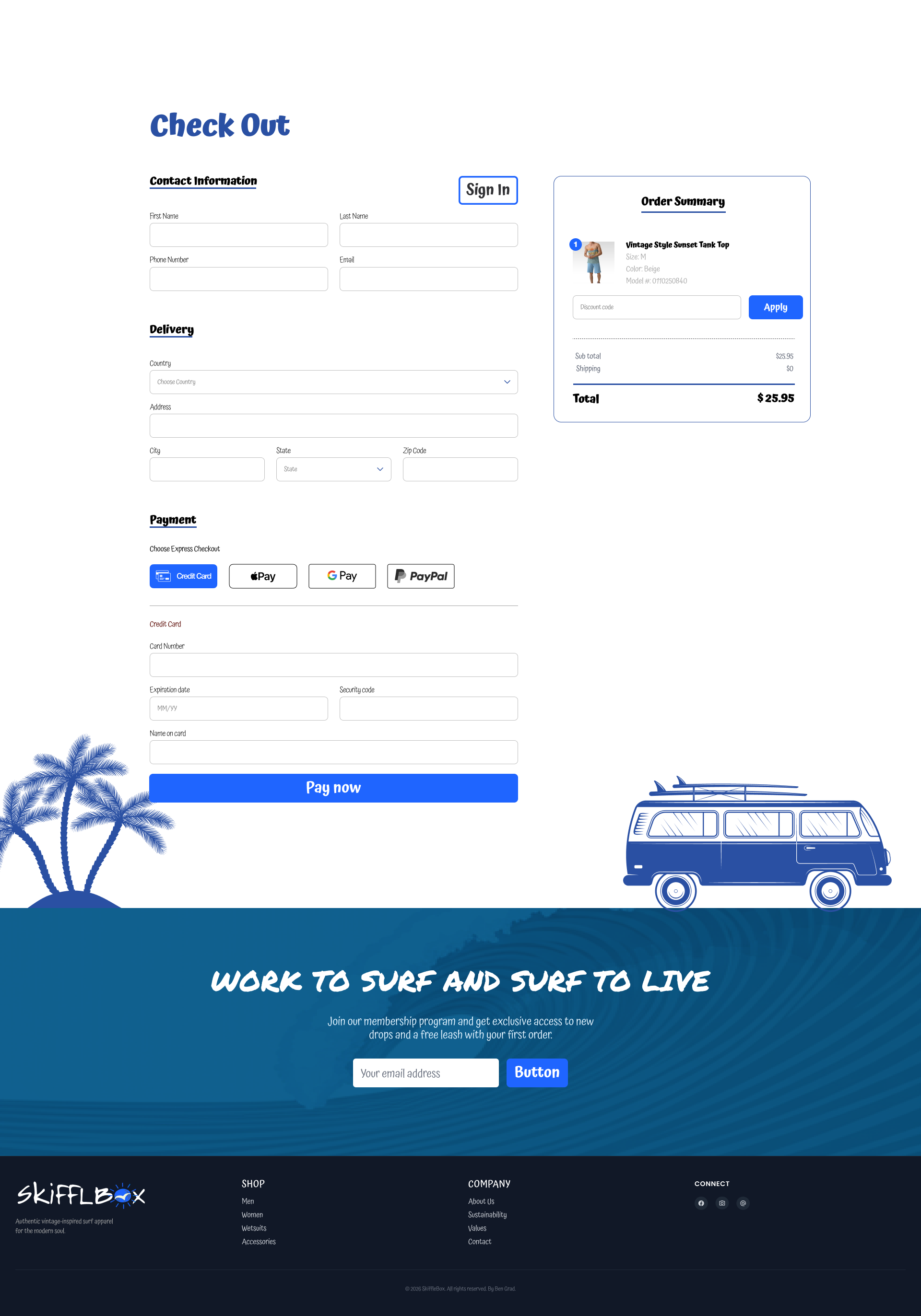
Once the brand felt solid, I designed the shopping flow: homepage, a men’s wetsuits category page, a product page for the Vintage Wave Tee, the cart, checkout, and a thank-you page. The ocean palette and the retro warmth run through all of it.
Key decisions
-
01
Led with “dress as you surf,” not “shop our sale.”
The store should feel like the brand first, so the promotional moments (Black Friday, the 10% membership) live inside that world instead of running it. Discounts fade; an identity people want to belong to is what actually keeps a brand alive.
-
02
Set the logo’s clearspace by the width of the “S”.
That way the mark sits the same on a small tee label and a full store banner. I wanted the system to hold up for anyone using it, not just me.
-
03
Treated contrast as a rule, not a preference.
Holding to 6.5:1 let the palette stay loud without ever costing readability or accessibility.
Result
It reads as one system, from the logo’s clearspace down to the checkout button. The part I’m proudest of is pulling a full brand book and a working store together in about a week without the two ever drifting apart.
What I’d do next: test the checkout with real users, add real product photography, and validate the membership offer.
Explore the file
The real SkiffleBox file, live. Pan and zoom the whole design, or flip to the clickable prototype.
Drag to pan · scroll to zoom the whole file